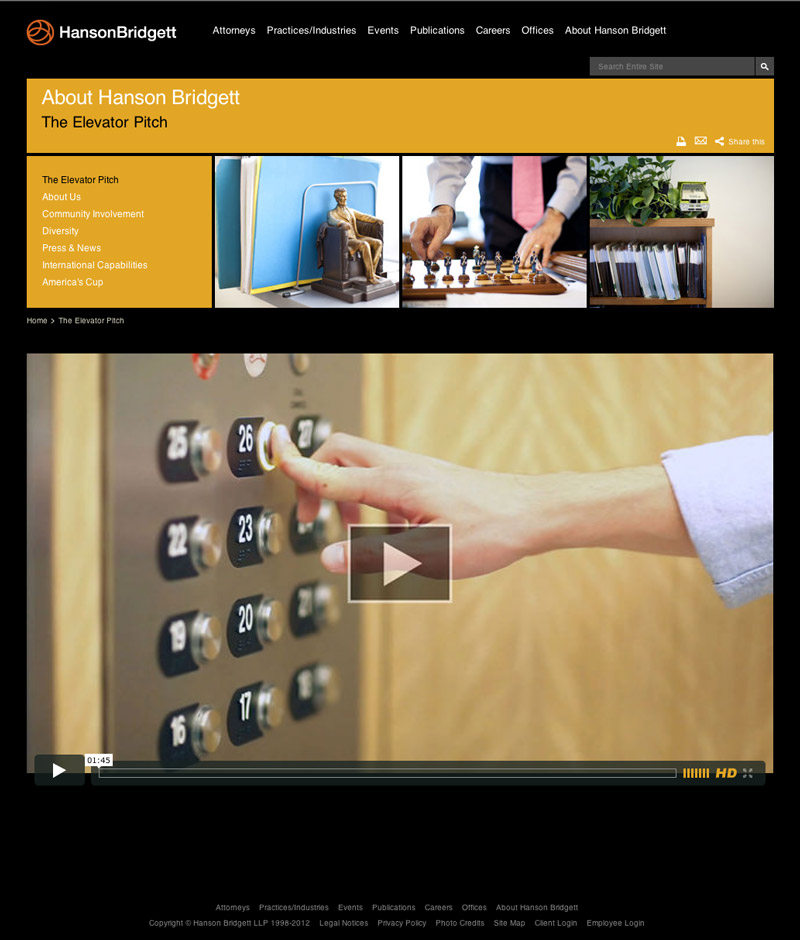
web site: Hanson Bridgett
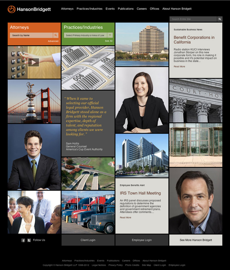
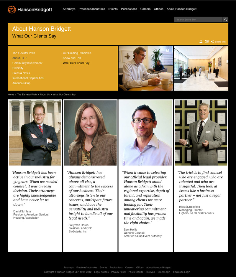
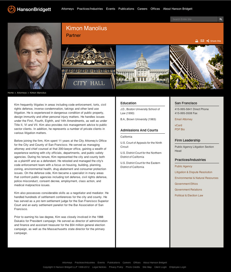
A complete overhaul radically improved user experience and internal efficiency through a data-driven design and an enterprise-class content management system. A distinct tone and style heralded an evolution of the firm’s brand and amplified key competitive messages. The innovative homepage approach was optimized to serve tactical and exploratory visitors equally well, while helping broaden perceptions of the firm for both. The end result showed an increase of 40% in time spent on the site.
Visit www.HansonBridgett.com »
Winner, 1st Place for Web Sites, Legal Marketing Association - Your Honor Awards
brand video: Hanson Bridgett
It was clear that the firm's story would be a human story, so we let our people tell it in their own words. Central themes emerged around the importance of a life beyond the firm and strong connections with clients. The play off the "elevator pitch" cliché comes from the idea that the ride up to the office each morning is where those personal and professional priorities cross metaphorically.
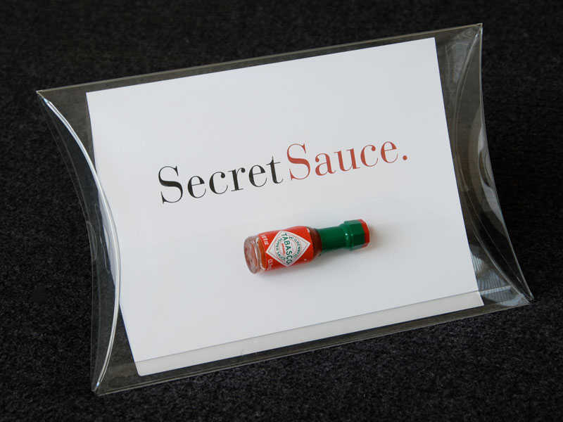
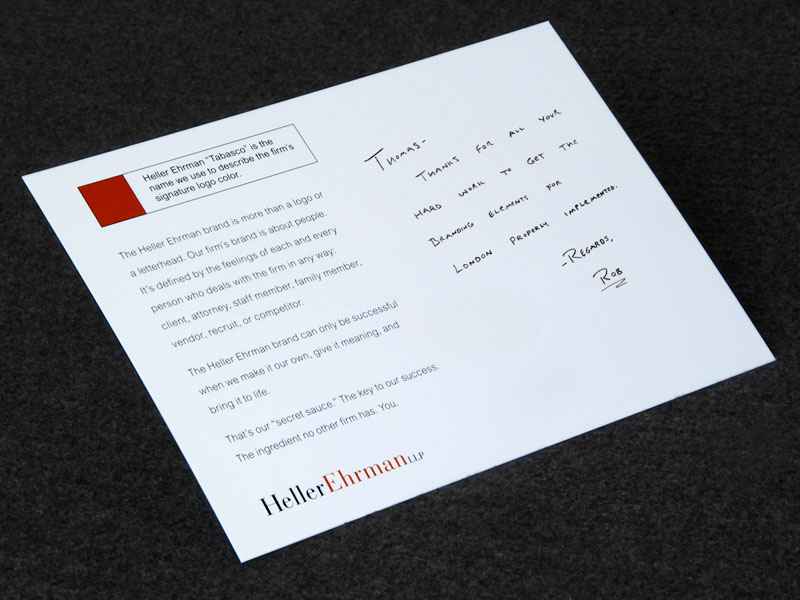
Brand Reinforcement: Heller Ehrman
No branding effort can succeed unless internal audiences accept and make it their own. At Heller Ehrman, I sought out internal brand champions to help in this area. The Secret Sauce campaign used a play on the firm’s advertising and it’s signature logo color, known internally as “Tabasco.” This piece was delivered to anyone who stepped beyond their direct responsibilities to recognize the firm’s brand as an important asset. The cards explained general brand concepts and were designed to become visible keepsakes. As recipients’ colleagues inquired about them, the cards spread brand thinking organically throughout the firm.
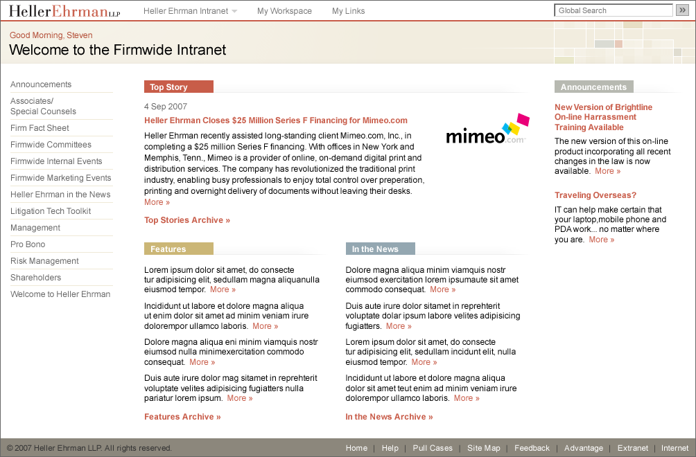
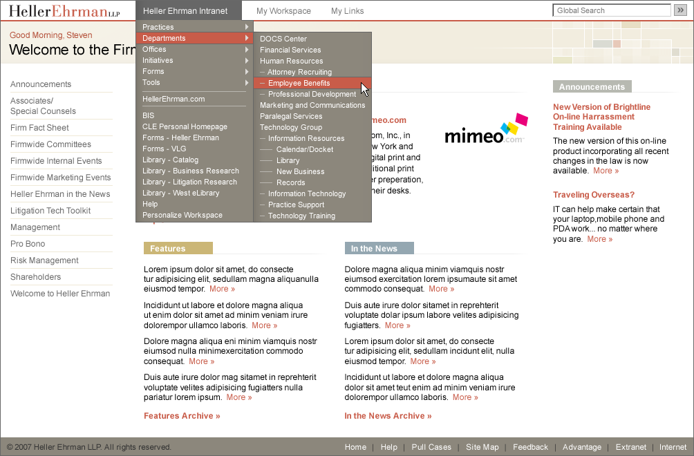
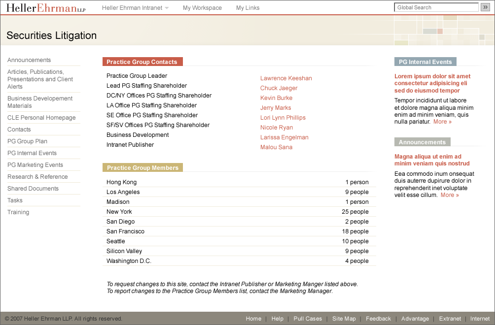
Intranet: Heller Ehrman
The firm’s intranet looked outdated, provided a poor user experience, and suffered from low acceptance. Complete redevelopment of the system was not a budget possibility, but our team used design skills to solve the problem with minimal cost or back-end implications. A visual facelift brought the site in line with the firm’s branding and gave the impression of a complete overhaul. A new, streamlined approach to navigation solved most of the user frustrations. And, by restructuring a few key pages, we created new channels for key internal communications. This project was a sterling example of what can happen when designers and developers blur the lines between disciplines.
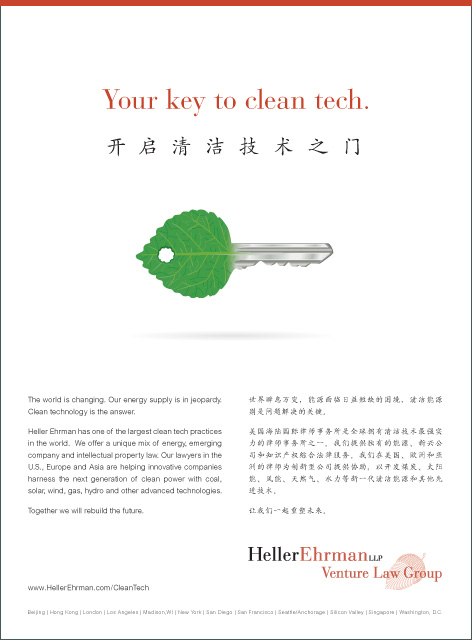
Bilingual Advertising: Heller Ehrman
Creating a single piece that needs to play well across multiple languages and cultures is tricky business. This ad sought to promote Heller Ehrman's unrivaled experience working with clean technologies to audiences at a major conference in Beijing. The ad needed to resonate with Chinese companies looking to get into the clean tech space, as well as with American and European investors looking to enter the China market.
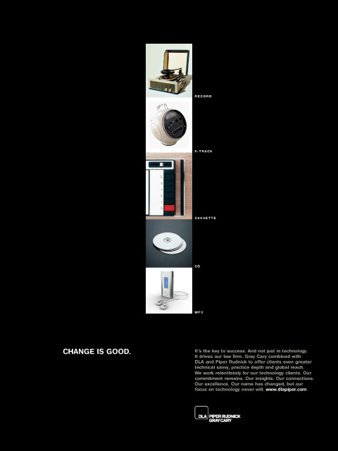
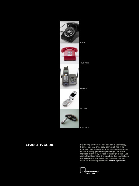
Advertising: DLA Piper
DLA Piper was formed by a three-way merger that gave clients unprecedented access to more than 3,500 lawyers spread across 22 countries. The scale of the merger also led to a market perception that component firm Gray Cary had more or less disappeared, along with it's significant commitment to the technology sector. This campaign, entitled "Change is Good," sought to assure tech industry leaders that they stood only to gain from the merger. The ads used advances in familiar technologies as a metaphor for the changes taking place at the firm.
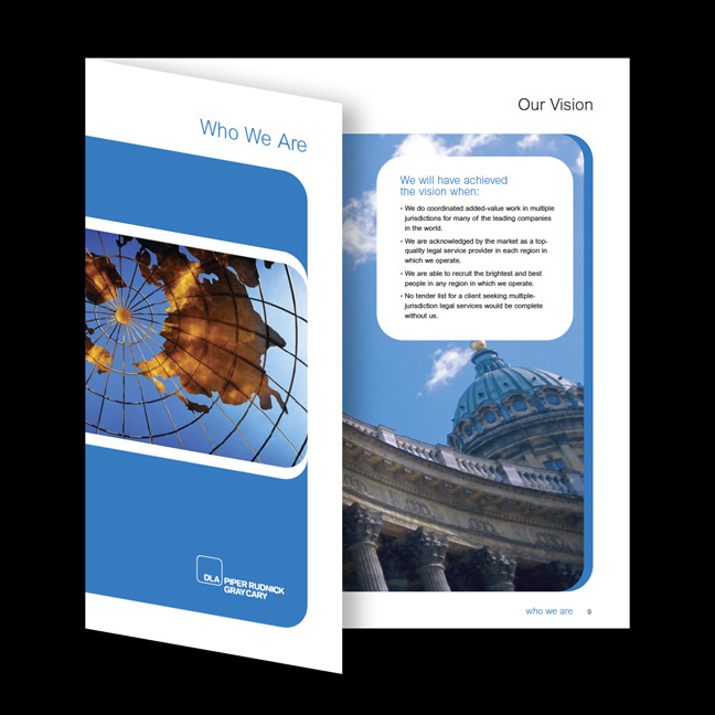
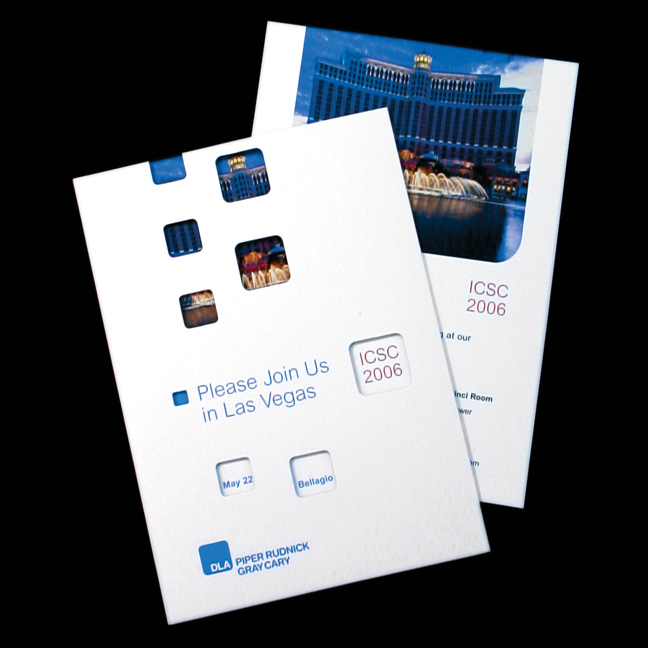
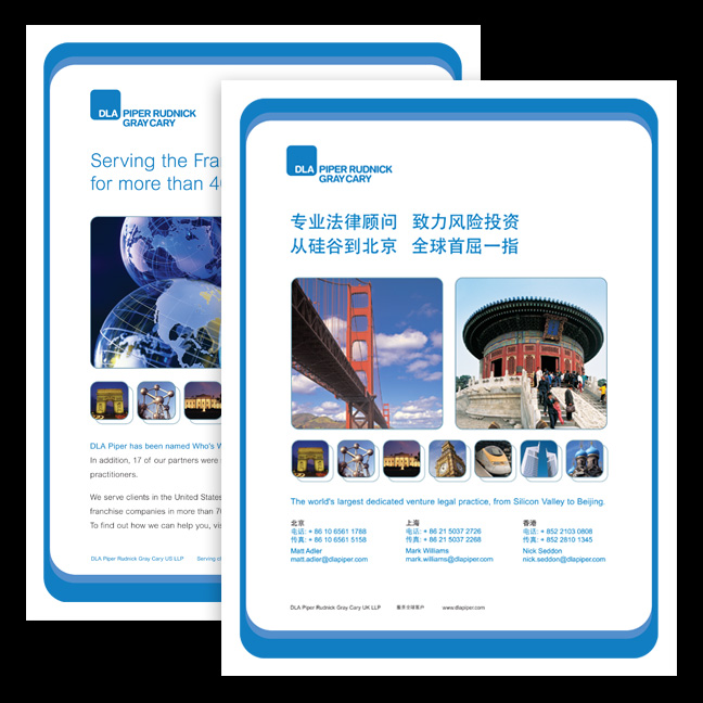
Collateral System: DLA Piper
The DLA Piper brand spanned a tremendous gamut of subject areas, geographies and business situations. In order to respond quickly to opportunities, the firm's creative team needed a design system that could maintain a strong brand presence while also being nimble and flexible enough to accommodate unforeseen circumstances. We developed a visual language that employed limited graphic assets to solve these challenges through the consistent repetition of color, form and photographic style.
program Branding: DLA Piper
With the rapid increase in DLA Piper's scale and scope, the internal communications landscape quickly became complex and overcrowded. Important programs within the firm found themselves in competition for limited attention spans, and their uncoordinated efforts were undermining work to develop a strong global brand. We addressed this problem by implementing a centralized internal sub-brand system. The solution allowed each constituency to express itself in a way that actually amplified the core brand and helped to develop it's personality for internal stakeholders.
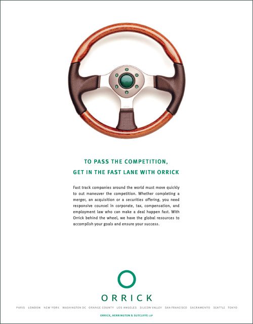
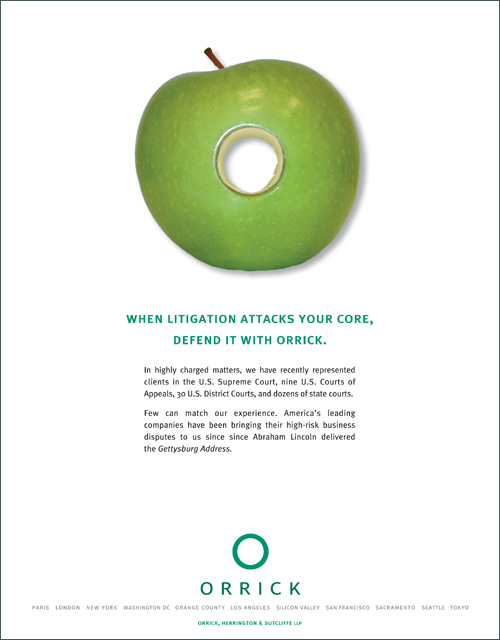
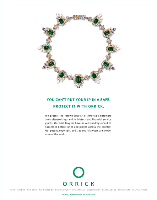
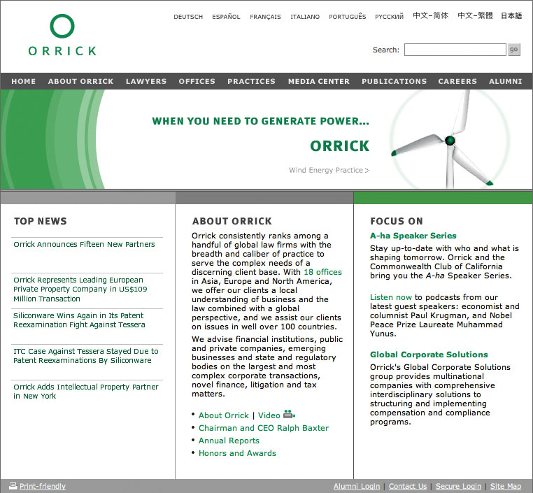
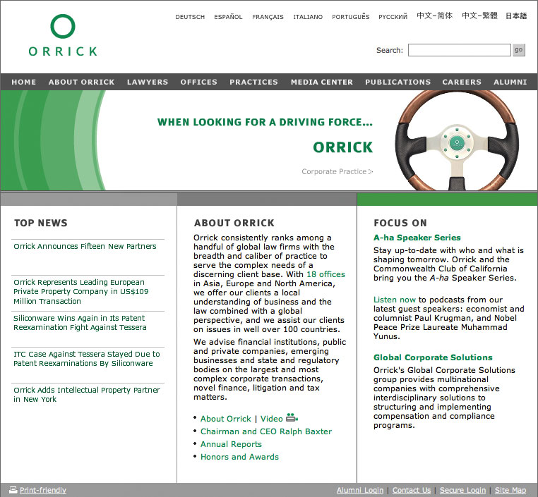
Advertising: Orrick
These advertisements were designed as part of Orrick's ongoing brand development campaign. Each ad uses an "O" image to portray a key issue faced by potential clients, while reinforcing the firm's identity. The ad copy uses a problem/solution format to highlight Orrick's capabilities in the appropriate area of practice.
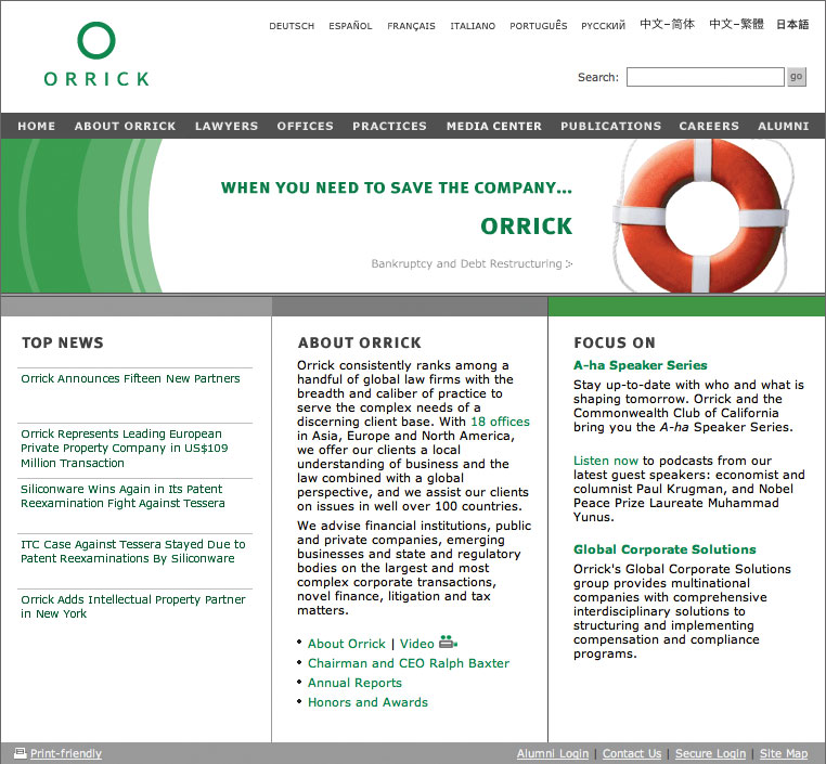
Web Site: Orrick
The visual design of the site was positioned to support Orrick's offline identity, while also establishing a distinct extension of the firm's brand for the online space. A marquee area on the homepage was used to create a new channel for Orrick's very successful print advertising campaign.
Winner, 1st Place for Web Sites, Legal Marketing Association - Your Honor Awards
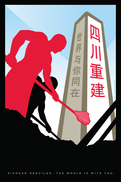
Poster: Sichuan Earthquake Relief
I was traveling in China with a group of designers from the AIGA Center for Cross-Cultural Design when the devastating 8.0 earthquake struck in Sichuan Province. Looking for a way the creative community could harness our talents to help with the crisis, I was honored to be invited to participate in a benefit poster exhibition organized by the Sichuan Graphic Design Association. The final posters comprised a traveling exhibit, and they were also posted outdoors throughout communities affected by the disaster.
Featured in Package & Design Magazine (China)